
Table of Contents
You might agree with me on this:
“Without some hard-hitting, emotional artillery copywriting, your product, your services, or whatever you sell online won’t get noticed”
That’s universally true.
However, you might need to understand this too; poor home page copy = poor sales or leads.
Although there are other factors come in the mix, clear and convincing copy is the uppermost priority that leads to conversion.
Why?
Because all the good things come from a home page. It receives visitors from a number of places.
They might come from direct traffic, paid traffic, blog, social media, press release and so on. This means a home page is served for different kind of people.
It’s like an airport that has a bunch of different places for a bunch of people to go to new locations. So much so that a home page is the starting point for visitors to go to different pages.
And because of that, a home page does a heavy lifting on design, usability, user experience, functionality and of course copy.
So how to start writing a super duper home page copy?
Before we begin, let’s unwrite first. Take a seat and read on why writing a home page is so crucial.
Home page copy is created to communicate your value proposition.
When first-time visitors arrive at your site, they have a purpose in mind. They are looking for a solution. And they want it quick.
So you have to clarify your offering. You have a few seconds to let people know what your site is about, and tell them why you are better than your competitors.
It’s too damn hard, right?
Value proposition or some call it unique selling proposition (USP), UVP or whatever, is the single statement that highlights the desirable and exclusive elements of your product/service in a succinct and memorable way.
Put it in this way; you have to write a memorable and benefit-driven statement that stop visitors’ track and make them say ‘Yeah, this is what I’m looking for’.
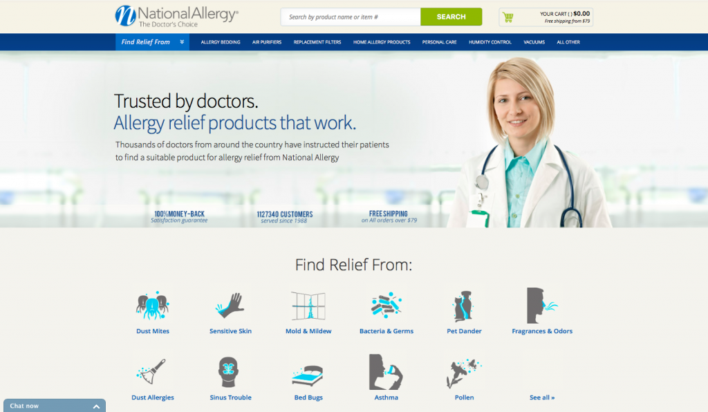
It generally appears as your headline on your home page and/or on the page that receives the most traffic, which means that you have to work extra hours to craft a home page headline.
Example:
Home page copy is used to expand your value proposition
A headline can’t describe your value proposition alone in ten words or less. It’s rare.
You may be able to get close. But if you have a number of different product or service categories, it’s better off keeping your headline simple, and then use short copy to expand on your value proposition.
That’s why several websites have a block of text or sections to extend the message and help your visitors to navigate their site.
For example, if you have 3 products or 3 different types of services, you could write a simple yet powerful headline. Then place short copy in the 3 different columns to send visitors to its targeted landing page or product/service page.
Example:
Home page copy is written to ease user experience
For ecommerce sites, the home page copy is generally short and packed with product images. But it does not mean you should throw copywriting out of the window and expect visitors to become buyers without guides and cue instruction.
This is where microcopy takes over the reign – little pieces of text which explain what to write in a form field, or a call to action text.
Here what a content strategy expert has to say about microcopy:
“This type of content is what we might call ‘micro-content’, i.e. the content that persuades and enables prospects to complete a transaction, whether this transaction is signing up for an email newsletter, downloading a white paper or making an online purchase.”
This transactional content includes benefit propositions justifying the transaction as well as the form-field labels, error messages and help text.”
Microcopy may has a tiny job to persuade visitors to take action.It has a significant role in guiding customers through parts of the process such as moving from home page to product pages and product pages to checkout pages.
Check out these examples on how sites are using microcopy to smooth the customer’s progress through the site, particularly on the home page:

Udemy suggests a course to search for in the search box
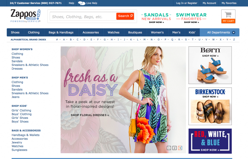
Zappos helps users search for a particular items by adding microcopy in the search box.
Now with the solid understanding of the importance of home page copy, you’ll realise that copywriting for the home page is not just mere words on the page.
It’s rather a strategic approach to move the visitors down the page and giving them ample information to make decisions.
But then comes the age-long question…
How much copy should I write?
There is much dispute among marketers whether the copy should be short enough to please the scanners or in the long form to convince the readers.
The best answer I can give is this: write as long as the copy is genuinely useful or interesting.
It means that the copy should be written based on what you want visitors to accomplish on the page, what information they need to make a decision to take action or how aware they are of the solutions that exist to their problems.
This comes down to the fact that writing for the home page is a little bit tricky and confusing. But when we understand the psychology of users read on the Web, you can write the copy that suits your visitors’ behaviour and preferences.
These 3 factors dictate the length of copy:
1. Goal of the page
Imagine your home page has only a headline and a call-to-action button, what a single activity you want the visitors to accomplish?
Go to another page? Read more down the page? Give the email address for subscriptions? Click to the checkout page?
Every business and service have a different purpose set on the home page, and this is why you should define your goal not just before you write, but before hiring a web developer.
You may have tons of things to say or information you would like to highlight on the home page, but setting a single overarching goal helps you write the copy the way your visitors want to see.
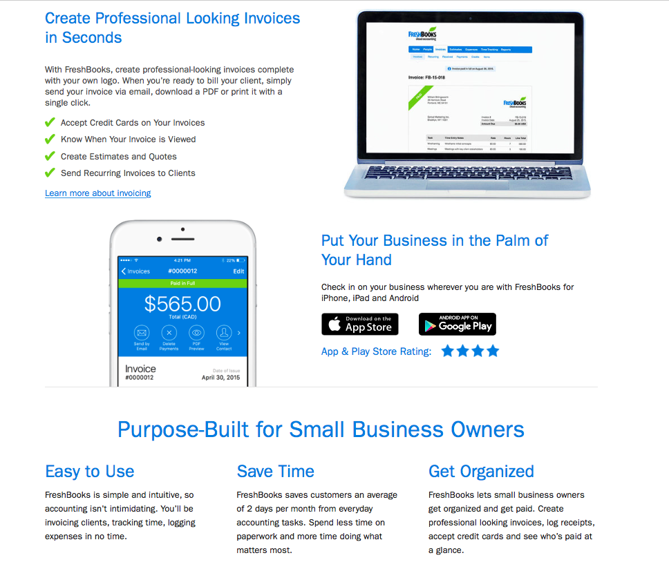
Take a look at Freshbooks’ home page, an accounting software for small businesses, has made signing up for a 30-day trial the dominant goal of the page.
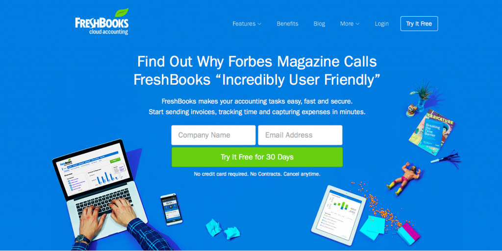
Freshbooks wants you to test out their software for 30 days. The free registration requires your company name and email address.
While you enjoy using their service for a month, you have the option to subscribe to full service or cancel anytime before 30-day trial ends.
You may decline to give your information beforehand as you require further information and the ‘What is it for me’ reason to commit.
Just scroll down the page and you can see how the amount of copy reflects your anxiety.
They wrote in chunks of text that set up the argument about the benefits of their solutions. Then, they give you all the reasons why Freshbooks is an incredibly user-friendly accounting software.
2. Figure out your visitors’ expectation and experience
It’s fair to say that writing for the Web is about writing what you want to say rather than what your visitors want to see.
This is prevalence in most websites by greeting the visitors with the headline like:
‘Welcome to our website.
’‘We are the best service provider in the country.
’‘We can meet your requirement.’‘At XXXX, we are your business partner, helping you to growth…’ and blah blah blah…
Those copy are crap.
In order to attract the visitors to read the copy and convince them to perform such actions, your copy should address your visitors’ perception and assumption.
Simply put, the copy is written to give immediate answers that relate to visitors’ enquiry upon arriving at the home page. This also indicates how much copy you should write to ease visitors’ anxiety.
Use messaging hierarchy to write the home page
When you are trying to figure out what audience-focused copy you should write, you can organise your message based on the order of assumption or questions your visitors may have.
The messaging hierarchy looks like this:
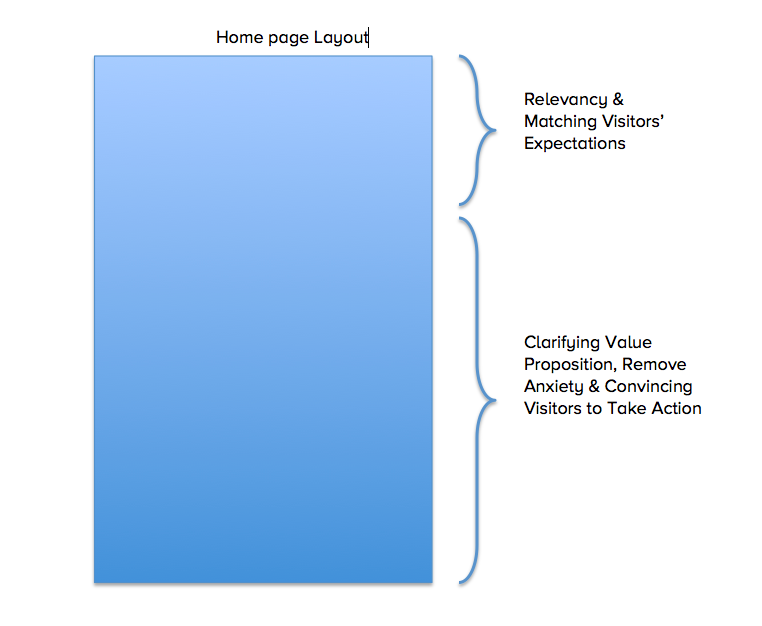
As you can see, the top of the page is about relevancy, matching visitors’ expectation and assumption.
There are first-time visitors, and they may come from Google or paid advertising ads. They are probably your target customers.
So the questions such as ‘What is this?’, Is this what I’m looking for? Is this where I expected to end up with? and Who are you? are stuck in customers’ mind upon landing on the home page.
Answer these in your copy: Put the logo of a company on top of the page. Write a benefit-driven headline and the supporting copy below it and a hero shot that reflects your brand (not a stock photo).
You may put the SEO keywords in the headline to match visitors’ enquiry that comes through search engines.
This formula works well for a one-pager site or a home page designed as a landing page.
Although I doubt how corporate-style websites and multiple pages site can execute this strategy, you can adjust the messaging hierarchy according to your business (refer to the first factor; goal of the page)
Example:
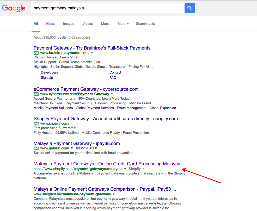
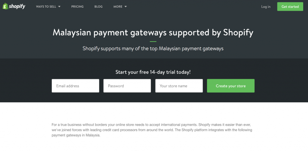
See how Shopify’s home page headline matches my search query for the ‘payment gateway Malaysia’ keyword.
I type ‘payment gateway Malaysia’ on Google, and I click Shopify as it matched my search query. See the keyword included in the title, slug and meta description.
Ta-da! The headline fits my expectation and needs. Shopify has won my heart in an instance!
Further down the home page is about clarifying your value proposition and persuading the reader to take action.
Explain in brief why customers need your product/service, the benefits and the end result of using your product/service.
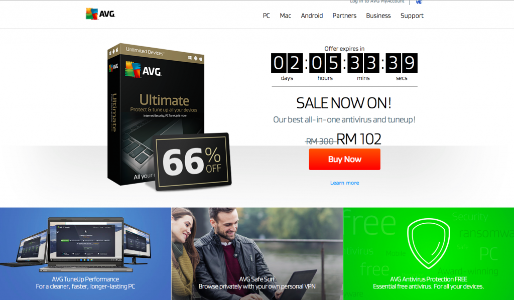
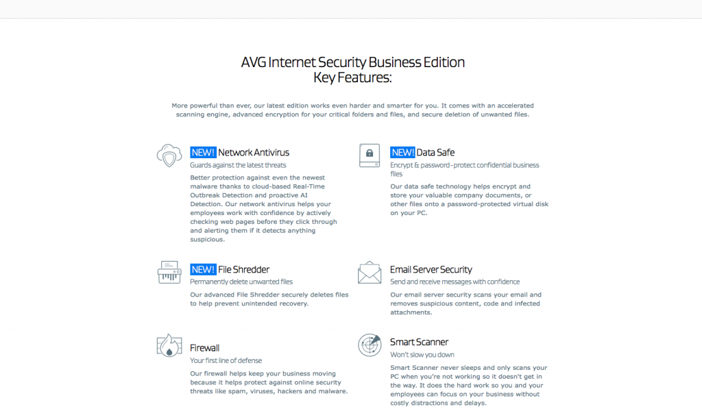
AVG does well to sell their key features with a compelling copy without compromising their brand value.
Other questions visitors might have:
Do I trust this site?
- The copy should answer the feel of the page, branding and the sense visitors have when arriving at the home page.
- It may not relate to copy; the visual design that reflects visitors’ motivation, need and personas, also look on the typography, colour, and visual cue.
- You may write about your background, your achievements, and your recent works.
Who else is using this and/or recommending it?
- The copy should speak about social proof; Who else has started cutting through the woods for me? Who’s already use your product/service?
- You may mention about testimonials but not just testimonials like ‘I like this product, it so cool.’ Try to get better testimonies that speak about your customers’ journey before finding your solution, the pain they had and finally their joy using your product/service.
Am I engage by this? Do I want it?
- Your copy should boost the desire to acquire your service/product. It’s one thing you need to make visitors engage by speaking to their concern and need.
- Summarise your offering with the photo of your product/service, a video explainer or a product demo.
What should I do now?
- Now it’s the time to close the deal, or tell what kind of action you need a user to perform to continue their experience.
- Add a call-to-action button with instructional text to tell what’s next to do, whether go to the checkout page or the product page.
- You may insert the opt-in form so you can capture the email address and give something valuable in return and then follow up them in the email.
3. Your customers’ state of awareness
The length of copy can also be determined by the level of awareness your prospect has when s/he arrives on your home page.
There are five stages of awareness, as described by the legendary copywriter, Gene Schwartz:
1. Most Aware: Your prospects knows you, trusts your brand and only needs to know “the deal.”
2. Product Aware: Your prospects knows what you sell but isn’t sure it’s right for him.
3. Solution Aware: Your prospect knows solutions exist for his pain but don’t know about yours.
4. Problem Aware: Your prospect is aware of his problem but doesn’t know there’s a solution.
5. Unaware: People who are not necessarily in need at this point.
Let’s go through each stage, shall we?
Most Aware: Prospects know their desire, they know you too
In the first stage, Most Aware, your prospect is completely aware of both his desire and your product. They already know you and like you – they just want to know your latest products and deals.
If your prospect falls into this state, then the copy should be short, simple and direct. Just tell the sizzling offer buried in the headline and add a big shiny call-to-action underneath it.
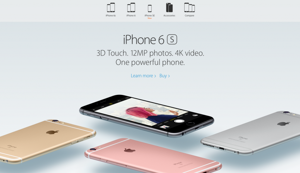
A big brand like Apple is a great example of targeting the Most Aware prospects. They don’t need to tell us who they are or what an iPhone is.
The brand alone is strong enough to convince their rabid fans to line up outside the Apple Store – they just want the latest version of iPhone 6.
Product Aware: Prospects aware their desire, know your product but don’t yet want it
In Stage 2, your prospect is fully aware of the need for your product, but they’re slightly unsure whether your product matches their desire. In other words, you must answer their ‘What is it for me?’ question.
So the copy should demonstrate the superiority and the exclusivity of your product or service. The headline should highlight the most novel or the latest feature in just a few words.
Then the rest of the copy should focus on benefits, dramatize how the product does, gives, or provides for its user. Tell about the specificity (time, number, attributes, etc.) in which your product has lots to offer.
As you can see, the length of copy is longer than that of Most Aware prospects. This is because you are now tussling against your direct competitors. Both you and your competitor have similar product or service, but you have to win prospect’s mind and heart with the selling skills.
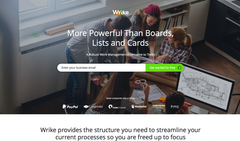
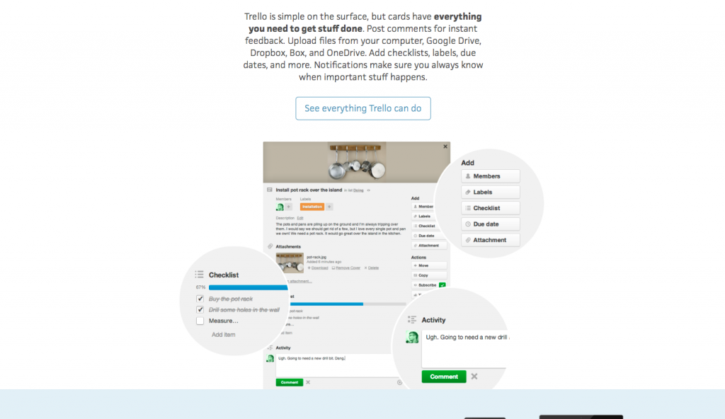
See the way Wrike tries to outplay their main competitors in the project management app niche, Trello.
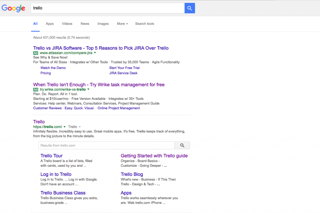
They started with the ‘Our feature is better ‘ type of headline and explained further down the page.
They even listed down their features against Trello’s in the comparison table. It looks like they are up to gain advantages over Trello.
(Note: Although no one says you can’t mention competitors’ name in your copy, I think you would be better off if you don’t say it)
My comment: Wrike should write longer to explain their features, their superiority over Trello and the reasons prospects should choose Wrike. I prefer Trello as their copy is engaging with the use of self-explanatory images.
Solution Aware: Prospect knows solutions exist but unaware about yours.
If you are about to launch a new product, your prospect probably falls in this state. They realize the need for a solution, and there is a product for that but they don’t know yours.
There are three steps to writing a home page copy for this state:
1. Identify and present the mass desire in the headline. You may focus on the primary benefits of your product or service.
2. Intensify and show the outcome of this mass desire in the sub-headline.
3. In the body copy, write about the specific feature in your product that satisfies that mass desire. Add claims and proofs that manifest the enormous potency of the feature.
See this website’s brilliant headline that speaks about the mass desire of people having fresh-pressed olive oil:
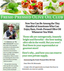
The sub-headline reinforces the outcomes of the mass desire. It then talks about the impressive feature of the subscription that satisfies the users. The use of authority figure on the left column enhances the credibility and prestigiousness of the product.
Problem Aware: Prospect knows his problem but doesn’t know there’s a solution.
At this stage, your copy should speak about the need or pain of your prospect.
Don’t feel a nudge to write about a desire because the prospect is experiencing a problem, and they need a solution now. But he can’t figure out the link between his need and your product.
That’s why you have to unleash the most primal motivator in your copy – fear.
By using fear, your prospect wants to avoid a loss at all cost more than what they gain. They are motivated to remove the threat that caused their problem rather than fighting the pain head-on.
Health supplements and weight loss products are the most common examples that use fear as the motivator, and the products were wildly successful in the direct mail and long-form sales letter.
So here is the formula; fear-agitation-solution:
1. State the fear in the headline. Make sure it is clear, straightforward and real.
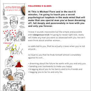
2. Agitate the fear in the sub-headline and body copy. Tap into their anger, guilt, embarrassment or bitterness. Make the readers reluctantly to say no to your agitation, which ultimately led them to say, ‘This has to stop, I should find the solution.’ Use shocking statistics and horrifying personal narratives.
3. Present the solution a.k.a your product in a straightforward and easy way. Show how your product solves the problem. Make an offer and close the deal.
It’s rare to write a home page copy for this state of awareness, but you may find marketers apply this formula for video sales letter.
Unaware: People who are not necessarily in need at this point.
As it name implies, the people in this state are unaware of everything; their desire, needs, products, features, benefits, price and so on. It’s highly unlikely that the Unaware would arrive on your home page and that makes them a weak lead and not necessarily worth to write for.
But it’s not always like that.
You see, although the Unaware prospects have no attachment to the elements in the previous stages, you can’t ignore them too soon.
That’s why marketers use the indirect approach to calling out people who are not yet become a prospect; the cold audience.
Then the marketers run the ad campaign to turn the cold audience into warm audience and finally into the hot audience.
Long form content or storytelling is an excellent way to get them in a mindset which allows marketers to advertise.
Conclusion
The art of writing compelling website home page is unique. Whether you’re writing copy for a one-pager home page or multiple pages website, there’s no one size fits all. It depends on what you want your visitors to do on your site.
So before you decide to write the copy or start building a website, always make sure you know these:
- the goal of the page
- what are your visitors’ motivation and expectation?
- what are their state of awareness and how that might affect your copy?
In the end, it’s not about short or long copy that leads to sales and leads – it’s about writing the right way.
Do you have a specific way to write a website home page? Write in the comment below.

